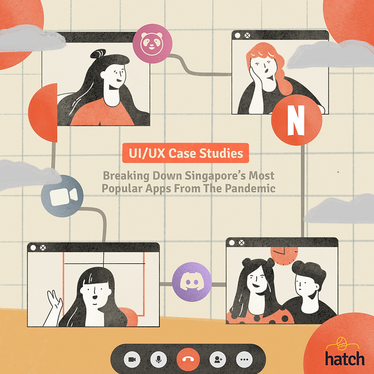
UIUX Case Studies: Unpacking Singapore’s Most Popular Apps from the Pandemic (Part 1: The Good)
Apps like Zoom, Netflix and foodpanda have become more popular both due to convenience and the pandemic’s hold over Singapore. They’re all apps we use on a regular basis, and with good reason. But some of these apps could still be tweaked to be better. Read on to see how these 6 apps’ UI/UX design performs based on our checklist for great UI/UX online.

We frequently come into contact with products or programs where User Interface and User Experience (UI/UX) design is crucial to their development. In this article, we’ll zoom in on how we encounter UI and UX online; in particular, with apps we’ve embraced with the arrival of COVID-19. If you’re interested in learning about UI/UX but have no prior knowledge, fear not! Read on to see our list of UI/UX examples — you’ll come to realise that UI/UX is actually all around us. With this knowledge, we hope it lowers any perceived barriers you may have in pursuing these high-growth fields. It isn’t as daunting as it seems.
Great UI/UX Designs during the COVID-19 Pandemic
Case Study 1: Zoom
Zoom is a program for video calling and online chatting, which enjoyed a surge in popularity due to the pandemic in 2020. Companies big and small embraced it as working from home became the “new normal”. Its greatest perk is how it can be used for various purposes, such as meetings, interviews and even webinars. Statistics have shown that from January to March of 2020, Zoom went from below half a million downloads to 2.13 million downloads daily. And within the span of 5 months, it soared from 10 million users a day to over 300 million users. Their mission is to make “video communications frictionless and secure”, and you’ll see just how this is done.
User Control & Freedom (Usability Heuristic #3)
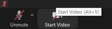
Zoom users are largely in control, from being able to rename themselves anytime, to customising their profile picture and background. Beyond visuals, they can toggle the mute and camera functions. This helps facilitate the conversation and reduce distractions when needed.
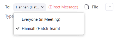
Additionally, users can choose between direct messaging specific participants privately or sharing their message to everyone involved.
Hosts can create smaller breakout rooms for group discussion, and everyone can alternate between them and the main room conveniently. This avoids the need to create another call specifically for group work. Lastly, users are able to share their screen with others, which is incredibly handy for collaborative work.
Clarity in Simple Design
Zoom’s interface is illustrated clearly, and additional words are used below visual icon cues (Mute, Share Video, Chat) to prevent misinterpretation. Users aren’t bombarded by content, since the information available is just right. The clear and simple interface design also reduces the cognitive load on users. Joining a call through clicking a link or entering the meeting ID reinforces how simple it is to launch the application.
Prompt, Meaningful and Clear Feedback upon User Action
When navigating through the interface, there’s clear feedback: hovering over icons reveals a rectangle around it that’s coloured differently. There is also a tooltip providing information about the hovered option.
Upon clicking, the icon and the tooltip change instantly; all these small details show us the program is guiding us as we interact with it.
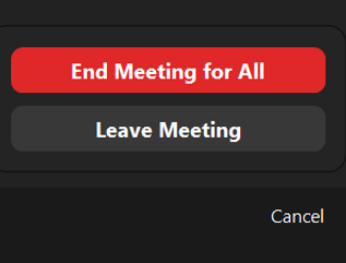
Attempting to leave the meeting room or close an ongoing call prompts you again along with an option to “Cancel”. This serves as confirmation, to ensure this is the action you want to take. It helps with error prevention as well, in case users accidentally click on it.
Design Consistency and Standards (Usability Heuristic #4)
Consistency comes through the location and appearance of symbols. Across computers, tablets and smartphones, buttons are situated at the bottom of the interface. The icons used are also the same throughout. Lastly, it’s also inclusive and accessible as a software. Zoom is supported on many types of devices with equal quality. Though it can’t currently provide signing for those who are hard of hearing, recording a call produces a transcript for easy reference. To cater to the visually impaired, hosts can opt to include closed captions. The software has shortcuts for action keys as well.
Case Study 2: Netflix
During the lockdown in 2020, Netflix saw significant increase in traffic (a 40% rise!), given how remote work makes using the streaming site more convenient too. But even before that, Netflix has been the most popular subscription video on demand (SVoD) service here in Singapore. Aside from having a vast array of titles to choose from, there’s also many UI/UX related reasons for this!
On Netflix, you can personalize your profile based on what you want to watch. Other than choosing a display picture and name, you can adjust video and audio quality. This is useful when you wish to save battery or mobile data. You can also toggle autoplay functions for playing the next episode or previews when hovering over a show. This helps you get an idea of what the movie is about without pressing into it. It also reduces the effort you need if you’re hoping to binge a particular series. Watching specific shows and adding titles to your “List” allows Netflix to suggest shows based on your preferences as well. This helps you discover new content that you might enjoy.
If you use Netflix on your TV, you might see an option called “Play Something”. Hit this button, and you’ll be presented with a show or movie depending on content you’ve watched on Netflix.
For users that can’t decide on a show, this option helps improve their user experience as well. “Play Something” might very well give you your new favourite show!
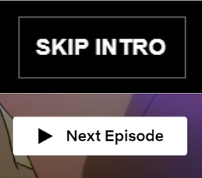
The tons of options displayed on Netflix’s main page do not overwhelm users. Content displayed is spaced well, and clear headers inform you why shows are in certain rows. While watching shows, buttons for “Skip Intro'' and “Next Episode” appear as well. This makes viewing shows easier for you, reducing your cognitive load.
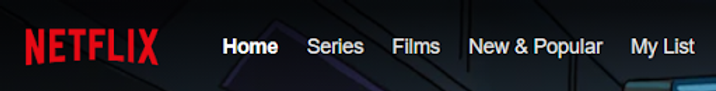
Rows of shows are displayed in order of importance, namely “Continue Watching”, “My List” and “Popular on Netflix”. Right on top are clear buttons for easy navigation, such as “Home” and “New & Popular”. This illustrates good visual hierarchy, with content that users prioritize being more visible and easier to access.
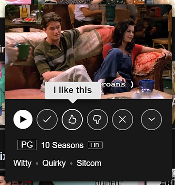
Icons are simple and intuitive, like Play and Thumbs Up/Down buttons. There’s no ambiguity behind them, facilitating effortless interaction. Many changes occur to provide feedback too, both visually and aurally. Hovering over a show expands its size, and when autoplay is enabled, certain shows cue previews. Moving over options brings up tooltips quickly as well, reducing misunderstandings and providing elaboration.
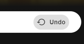
As shows are listed in horizontal rows, there’s an arrow that expands to aid clicking, assisting your side-scrolling. Netflix also provides an Undo button when removing shows from lists, allowing for error prevention.
Across devices, Netflix is also visually consistent. The icons, buttons and typography are identical on every device. This aids the user experience by instilling familiarity and constants through using the service.
Lastly, it’s highly accessible. Netflix is screen-reader friendly, and users with vision impairments can choose to consume content in different languages as well. Audio description can be enabled, so users can grasp changes or events occurring that are not narrated. For users who are hard of hearing, closed captions are provided in various languages. These also include sounds that occur concurrently in shows.
Case Study 3: Discord
Discord is a software made for voice communication within groups of people. It started out as a platform for gamers to speak conveniently in-game, with little impact on the gaming experience. Because of its ease, Discord has become increasingly popular with various communities. Many existing servers extend beyond gaming, such as study groups, book clubs, and even communities for shows, music and so on. With screen sharing and the “enable camera'' function being made available, companies may use it for remote communication as well. Like Zoom, many people used Discord during Circuit Breaker in 2020 to chat with friends and have fun together while gaming. It largely follows the guidelines we’ve mentioned, which explains why it’s highly favoured.
Users can customize profiles, from display names to statuses and pictures, without worrying about being unrecognizable. This is because each user has a unique number tag attached to them. Having those numbers alone is enough to find others. You can also have different nicknames in each server you are a part of!
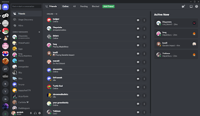
Discord is also easy on the eyes in its original dark theme, with each page displaying only necessary information. There’s a logical, smooth visual hierarchy which directs you to the important bits. This refers to the servers and messages on the left, friend list in the center, and friend activity on the right (which you can hide too – even more customization!). Along with how everything is well-positioned, there’s no cramming of content and these all help reduce cognitive load.
Like the other two programs, Discord offers feedback in similar ways. If you hover over servers, their logos turn from circles into squares, and clicking them shows the icon being nudged slightly, just like pressing an actual button.

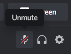
Joining and leaving a server’s voice channel lets out a brief sound indicating your movement. Similarly, muting or deafening yourself (disabling input and output) produces unique sounds, and the icons are slashed to show clearly Discord has acknowledged your actions.
Removing a friend or blocking someone can also be cancelled or confirmed. You can undo blocks on the “Blocked” list, situated right at the top, allowing you to prevent errors.
Finally, Discord is also supported on various devices, and the interface is consistent throughout them all. For accessibility, there, unfortunately, isn’t much now for those who are hard of hearing. (Something the developers should look into!) However, for those who are visually impaired, screen readers are supported. There’s an interesting function to try – “text to speech”, where users who are not speaking can produce an automated voice over. Additionally, there’s settings for you to reduce the ingrained motions and animations within Discord. You can stop GIFs and animations from being auto-played as well!
Good design is invisible
Zoom, Netflix and Discord are examples that highlight how UI/UX are intricately woven into our daily lives. Each of their development teams did a great job designing with UI and UX considerations in mind.
That essentially means placing users at the forefront. That is how apps or software can be good to use and become well-received.
This is the second article in a three-part series on the design of online applications. If you’re interested, learn how you can identify good UI/UX online, and what contributes to the success of a design.
151 Lorong Chuan, #05-06 New Tech Park, Singapore 556741